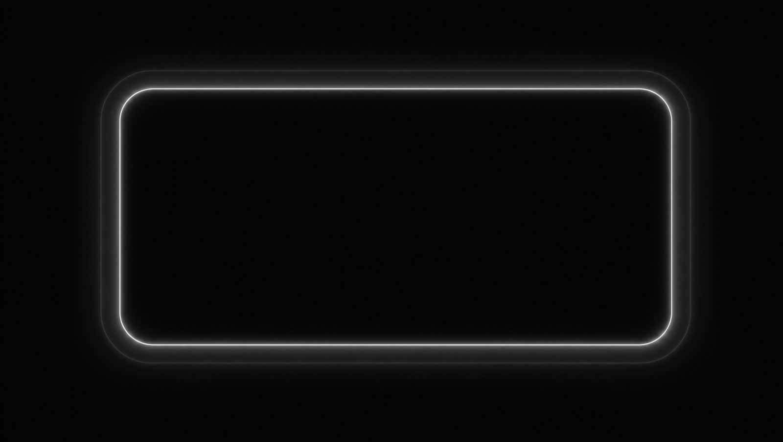
Focus rings you can actually see
Jul 22, 2026 6 min
Jul 22, 2026 6 min
Every design system I have worked in eventually files the same ticket: the focus ring is too loud. It gets softened, then thinned, then given an opacity, and about a year later somebody discovers that you cannot tab through the checkout.
I understand the impulse. A default focus ring is genuinely ugly. It is also the only thing standing between a keyboard user and a page they cannot navigate, so the fix is to draw a better one, not a quieter one.
A focus ring answers one question: where am I? It has to answer it from across the room, at a glance, on whatever background it happens to land on. That is a much harder job than a hover state, and we keep designing it as though it were an easier one.
Two properties do almost all the work.
Get those right and you can make the ring as tasteful as you like.
For years the trick was box-shadow, because outlines could not follow border radius. They can now, everywhere, and outlines have a property shadows do not: they are never clipped by overflow: hidden.
:where(a, button, input, select, [tabindex]):focus-visible {
  outline: 2px solid var(--color-accent);
  outline-offset: 2px;
}
That is the whole thing. Two lines, one token, and it inherits your brand colour for free.
An outline with no offset looks like a border that got thicker, which reads as a state change rather than a location. Two pixels of daylight between the element and the ring is the difference between this input changed and you are here.
On a dark control sitting on a dark surface you may need a second ring in the background colour underneath the first. It is worth the extra line.
The reason everyone wanted the ring gone in the first place was that it fired on mouse clicks. :focus-visible fixed that in 2022 and I still find :focus in new code most weeks.
If you take one thing from this: search your codebase for outline: none right now. Whatever you find, there is a good chance nothing replaced it.